Want to know the difference between seasonal and tonal colour palettes? Keep reading to find out the best system for you to use to find your WOW colours.
Colour analysis is a wonderful tool that can help identify the best colours that work in harmony with our natural colourings. There is such a huge benefit to understanding your unique colour palette and discovering how to wear colours with confidence.
Wearing the right colours will illuminate your complexion, we all have a few WOW colours that work perfectly for our unique complexion and discovering these can totally transform your style, your energy and your zest for life!
Most people don’t struggle because they don’t understand colour. They struggle because they don’t know how to interpret it on themselves. And this is where the difference between seasonal and tonal analysis becomes more complex than it first appears.
Everyone’s eye for detail varies – whilst some see the impact of colour clearly, others do not. The best way to understand your colours is to understand how you see colour and how to spot the way colour affects you.
READY FOR COLOUR CLARITY?
Stop guessing which colours work for you — with a private 1:1 online experience.
Seasonal and tonal colour palettes explained
In this comprehensive guide, we’re looking into the ways to carry out colour analysis, focusing on the widely recognised 4 seasons and their tonal sub-seasons. After reading this you should be able to understand if you fall into the Spring, Summer, Autumn, or Winter palette, with a tonal direction such as:
- Soft (Muted),
- Light,
- Deep, Dark,
- or Bright (Clear)
This will help you’ll uncover the colours that harmonise perfectly with your natural beauty.
For some people, this system creates immediate clarity. For others, it raises more questions than it answers. You might recognise yourself in parts of one season, but not fully. Or find that colours that should work, don’t feel quite right in practice.
Let’s get started with the breakdown of the two main colour analysis systems in use:
Seasonal colour analysis: True Summer, True Winter, True Autumn and True Spring
If you fall into a True season, you’ll likely match the popular descriptions used for that particular season. Whether you are a True Winter, True Spring, True Summer, or True Autumn, your features exhibit distinct clarity that makes the majority of the colours in the True colour palette perfect for you. There will always be some colours that you don’t like or want to wear, and that’s fine (and to be expected). To find out more about the typical characteristics of each season, click through to the colour analysis guides linked beneath each colour chart. Note, that the 4-seasons guides I have created refer to the seasons using their undertone either Warm or Cool.

Defining attributes of a Summer: A softness, coolness and low to medium contrast between hair, eyes and skin. To find out more about a ‘Cool Summer’ in the 4-season colour analysis system read the Cool Summer Colour Analysis Guide.
Winter season colour palette

Defining attributes of a Winter: Brightness, coolness and high contrast between hair, eyes and skin. To find out more about a ‘Cool Winter’ in the 4-season colour analysis system read the Cool Winter Colour Analysis Guide.
If you’re reading this and trying to work out where you sit, it’s completely normal to feel uncertain. Most people move between categories, second-guess what they’re seeing, or feel like they fit into more than one description.
Spring season colour palette

Defining attributes of a Spring: Brightness, warmth and low to medium contrast between hair, eyes and skin. To find out more about a ‘Warm Spring’ in the 4-season colour analysis system read the Warm Spring Colour Analysis Guide
Autumn season colour palette
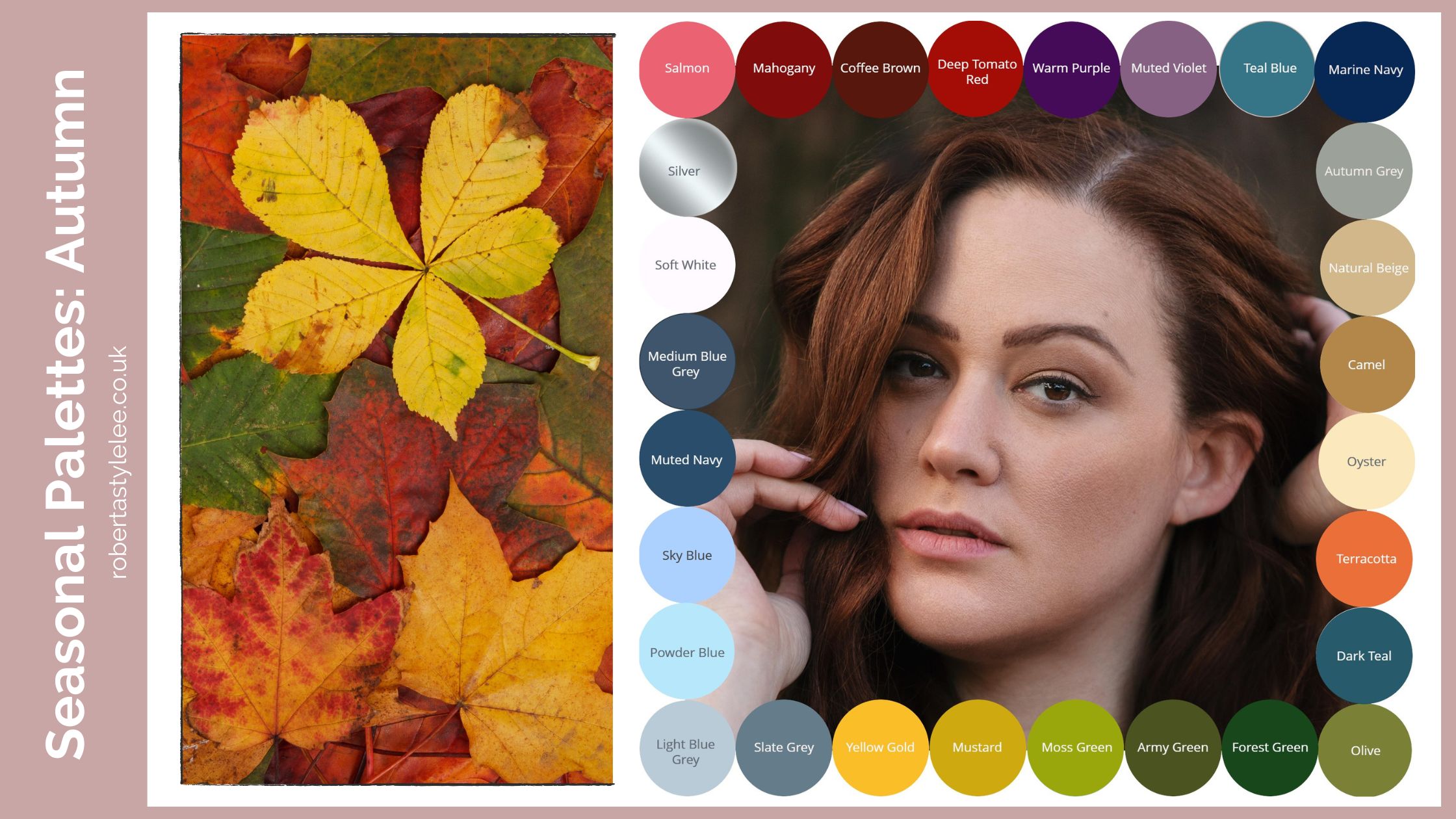
Defining attributes of an Autumn: Earthiness, and undeniable warmth, varying from high, medium to low contrast between hair, eyes and skin. To find out more about a ‘Warm Autumn’ in the 4-season colour analysis system read the Warm Autumn Colour Analysis Guide
Tonal colour analysis system decoded
All of the tonal directions can be associated with one or two of the seasons. Whilst these are the popular ones, there are many more crossovers. Given we are all unique it stands to reason that these formulas won’t be entirely accurate for everyone, however, they are a good starting point. As mentioned before, the purpose of the tonal direction is to give further accuracy to the best colours within a particular season, you will find yourself better suited to Soft (Muted), Light, Deep, Dark, or Bright (Clear) colours within the Spring, Summer, Autumn, or Winter palette.
| Tonal description | Season | Season | Your best colours |
| Light | Light Spring | Light Summer | The lightest of colours between Spring and Summer |
| Deep | Deep Autumn | Deep Winter | The deepest richest of colours between Autumn and Winter |
| Dark | Dark Autumn | Dark Winter | The darkest of colours between Autumn and Winter |
| Soft / Muted | Soft Summer | Soft Autumn | The softest and gently muted colours that sit between Summer and Autumn |
| Warm | Autumn | Spring | The warmest of colours that sit between Autumn and Spring |
| Cool | Summer | Winter | The coolest of colours that sit between Summer and Winter |
| Bright / Clear | Spring | Winter | The brightest and clearest of colours that sit between Spring and Winter |
This is where many people start to feel stuck. The more precise the system becomes, the harder it can be to confidently place yourself within it. At this point, more information doesn’t usually solve the problem. It often creates more noise.
Breakdown of the tonal direction within each colour season
- Spring Palette: Embrace the Freshness
- Soft Spring: Subtle Tones and Delicate Pastels
- Light Spring: Bright and Cheerful Hues
- Deep Spring: Rich and Intense Shades
- Bright Spring: Vivid and Contrasting Colours
- Summer Palette: Embrace the Serenity
- Soft Summer: Cool and Muted Tones
- Light Summer: Ethereal and Airy Hues
- Deep Summer: Softly Rich Shades
- Bright Summer: Clear and Crisp Colours
- Autumn Palette: Embrace the Warmth
- Soft Autumn: Subdued and Earthy Tones
- Light Autumn: Warm and Golden Hues
- Deep Autumn: Rich and Intense Shades
- Bright Autumn: Bold and Warm Colours
- Winter Palette: Embrace the Contrast
- Soft Winter: Cool and Muted Tones
- Light Winter: Icy and Clear Hues
- Deep Winter: Intense and Dramatic Shades
- Bright Winter: Vibrant and High-Contrast Colours
What does colour tone mean?
The tonal directions take into account variations in colour intensity, contrast, and depth. In colour theory, colours are broken down by the following aspects:
- A tint = A colour with white added, which increases lightness (affecting colour saturation) > High-Intensity Vs Low Intensity
- A Shade = A colour mixed with black, which intensifies its depth and darkness. (affecting colour saturation) > Dark Vs. Light
- A tone = A colour with grey added the colours become less vibrant and more muted (softer) > High contrast Vs Low Contrast
Understanding the characteristics of your tonal sub-season is key to selecting the most flattering colours for your complexion. This means tints and tones are variations that are lighter/softer than the original colour. It helps us then define the colours used in the tonal directions for colour analysis: Soft (Muted), Light, Deep, Dark, or Bright (Clear).
High / low-intensity colours

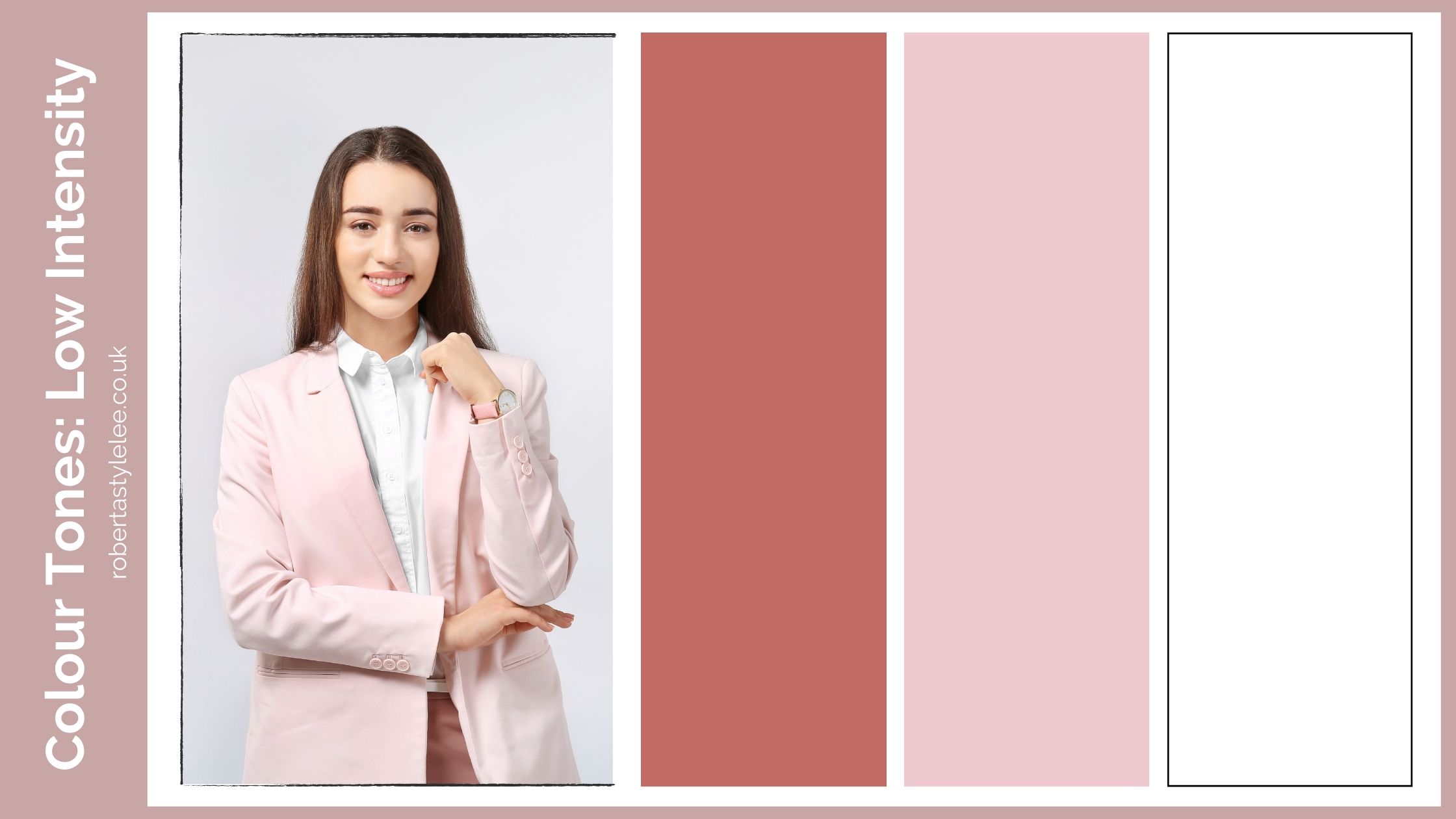
Intensity: Intensity refers to the brightness or vividness of a colour. Colours with high intensity are bold and vibrant, catching the eye easily. For example, imagine a traffic light’s red or a neon pink sign—these are high-intensity colours that demand attention. On the other hand, colours with low intensity are more muted and subdued, like a soft pastel blue or a light sage green like the inside of an avocado.
High/low contrast colours
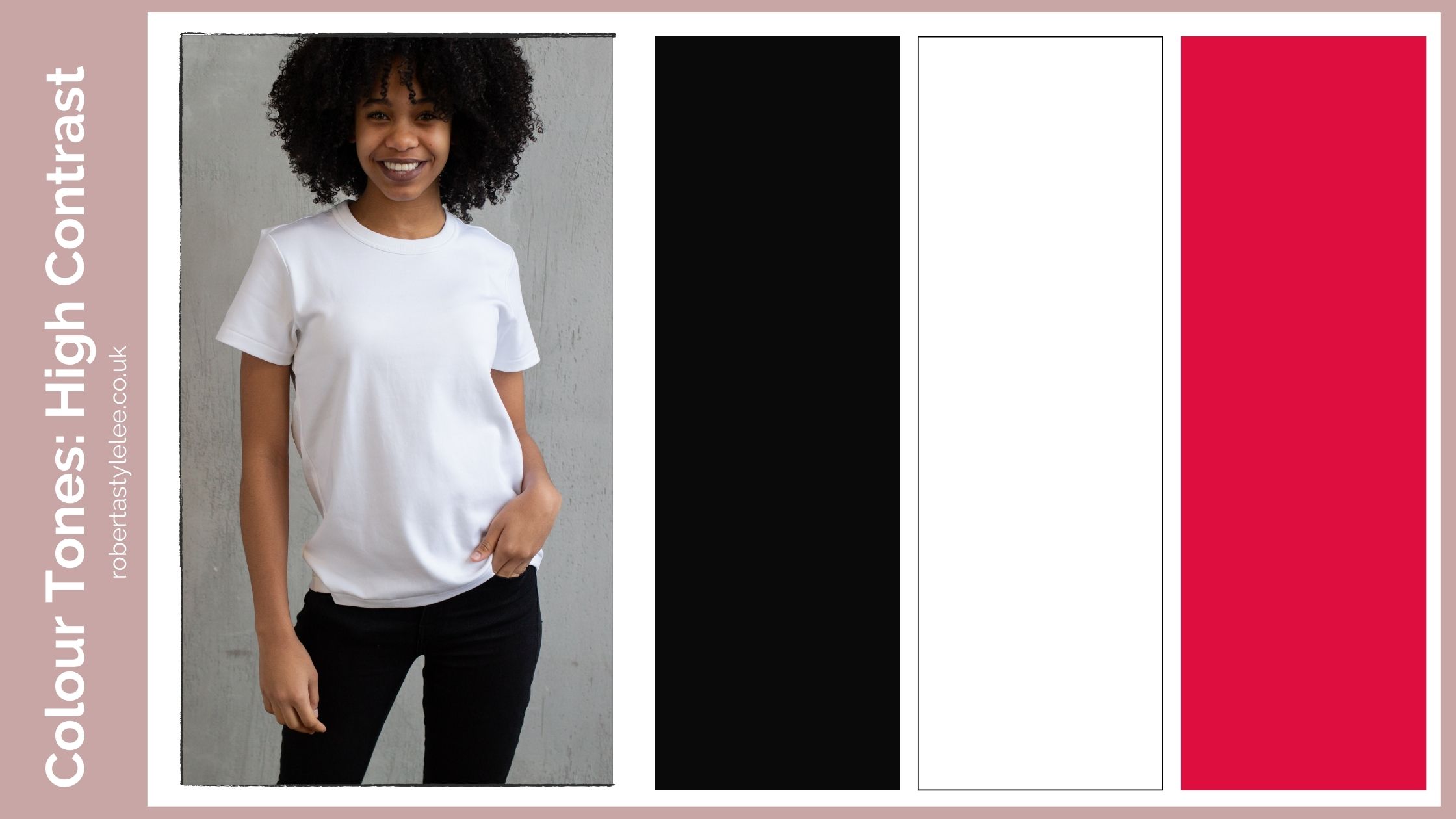
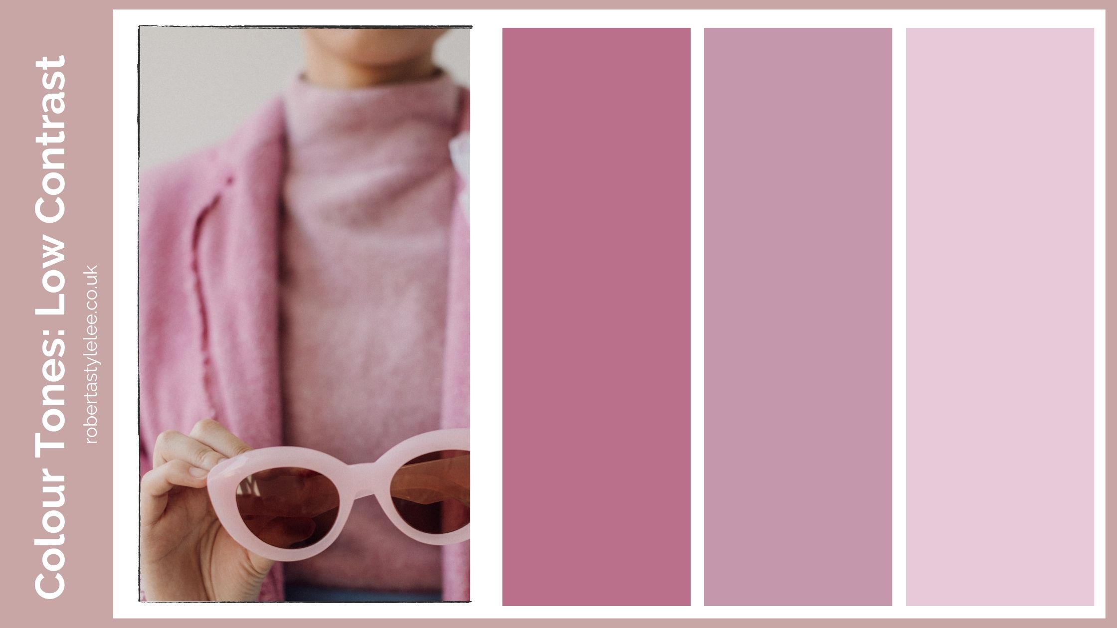
Contrast: Contrast measures the difference between the lightest and darkest colours in an outfit or colour scheme. High contrast occurs when pairing colours with significant differences in lightness and darkness. Think of a classic black and white outfit or bold combinations like black and bright yellow like a bumble bee. The opposite, low contrast involves colours that have minimal difference in lightness and darkness. An example would be combining different shades of pink, known as tonal dressing – which can be a sophisticated way for those with lower contrast in their features to wear the colour head to toe.
Dark/light colours

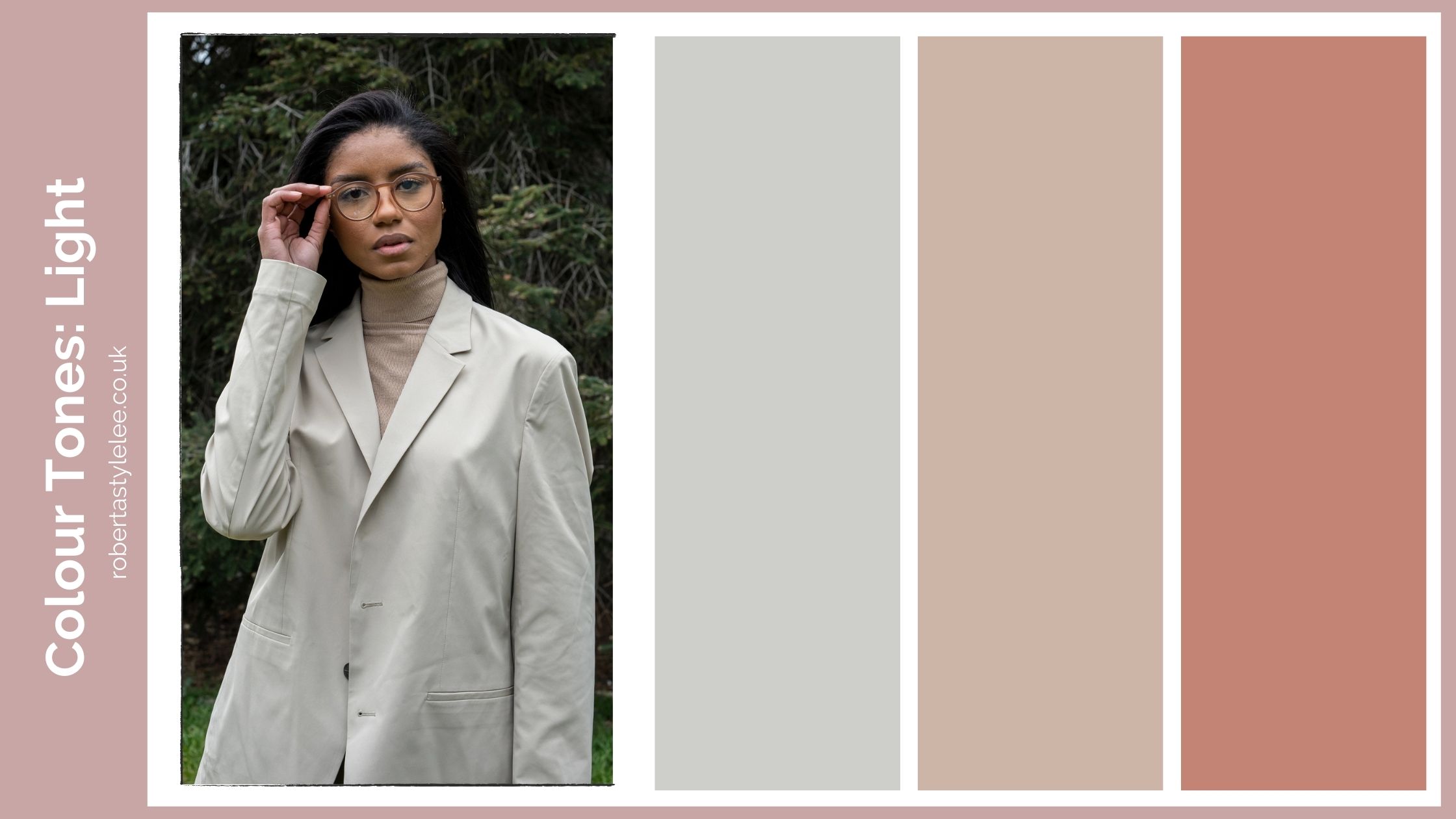
Depth: Depth refers to the overall richness and darkness of a colour. Deep colours have a darker appearance and can evoke a sense of luxury, mystery and sophistication. For instance, a deep burgundy or a rich emerald green. On the flip side colours with less depth appear lighter and fresher, like a shell found on the beach or the lightness of the sand on a lovely clean beach.
Understanding these colour tone aspects can help you make intentional and harmonious choices in your wardrobe and makeup. You’re not just one of these characteristics. You’re a combination of them. And it’s the balance between these elements – not just the label – that determines what actually works on you.
Finding your tonal colour palette
Within a particular season, you’ll have variations of colours that will be better suited for you, based on your defining features. Within the tonal system, you will have a primary identifier which will always be used ahead of the colour palette. For example, if you’re most obvious feature is softness, you’d be soft and then based on your undertone, if you are warm, you’d be soft and warm, so you’d be soft autumn.
Take a look at the examples below and try and identify if your features are similar to the models used in each image. What you are looking for is the primary features, what stands out the most overall about your personal unique characteristics.
Here’s the list of identifiers that are used in tonal colour analysis, try and identify yours:
- Softness (Muted)
- Light (Very fair)
- Deep and/or Dark
- Bright (Clear)
- Warmth
- Coolness
Tonal colour palette: Soft
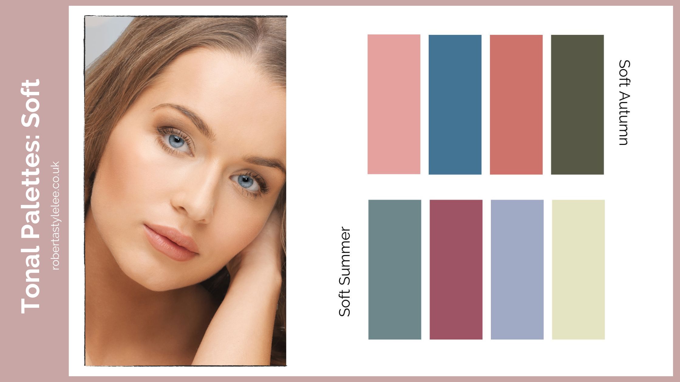
If you belong to the Soft tonal sub-season, you are likely to have a delicate and muted colouring. Your skin tone may have a subtle warmth, and your hair and eye colours may have a gentle contrast. Soft sub-seasons tend to gravitate towards softer shades with medium to low intensity. Think pastel hues and light earthy tones. These colours compliment your understated gentle elegance and bring out a sense of softness in your overall appearance.
Colours that work well for soft sub-seasons include pastel hues, such as dusty pinks, light mauves, and soft blues. These colours harmonise with the softness of your features and bring out a sense of gentleness in your overall appearance. Earthy tones in muted shades, like moss green, dusty rose, and soft lavender, also complement your colouring.
Styling Tips: To create a cohesive and flattering look, consider combining soft colours in different shades and textures. Pair a pastel pink blouse with light grey trousers or a soft blue dress with nude accessories. Opt for fabrics with subtle patterns, such as floral prints or delicate stripes, to add interest without overwhelming your soft colouring.
Tonal colour palette: Light
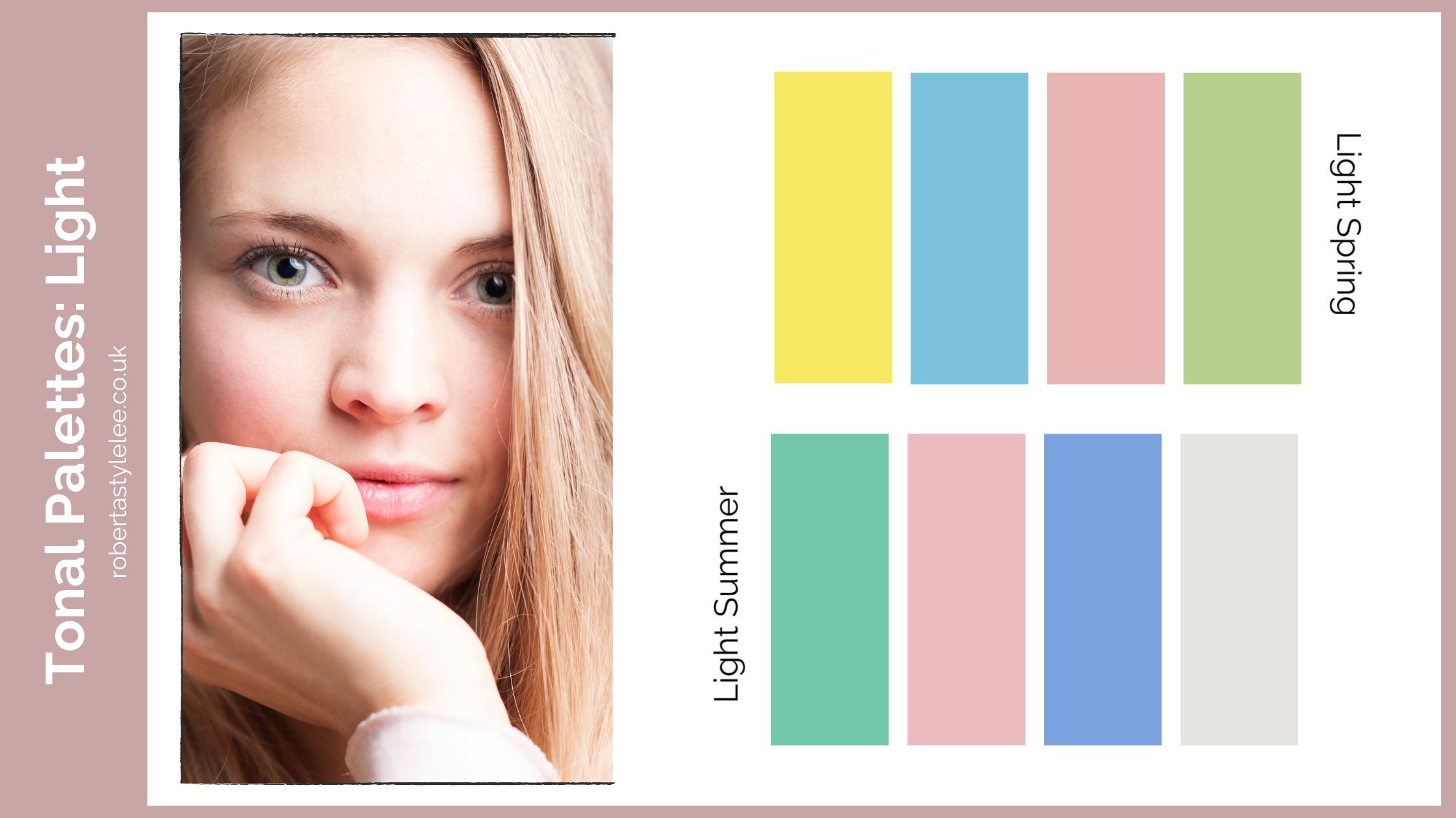
The Light tonal sub-season is characterised by a light and airy quality to your colouring. If you belong to this sub-season, your skin tone may have a cool or warm undertone, and hair and eye colours are typically light or bright.
Light sub-seasons thrive in softer and lighter shades. Think pastel colours, baby blue, mint green, and baby pink. These colours gently harmonise with your natural lightness and luminosity and create an ethereal and fresh look. Neutral colours such as ivory, light grey, and soft beige will create a strong foundation for your wardrobe.
Styling Tips: Embrace monochromatic looks or tone-on-tone combinations with light and soft colours. For example, pair a blush pink blouse with light grey trousers or a mint green skirt with a cream-coloured top. Incorporate subtle textures, like lace or chiffon, to add dimension to your outfits.
Tonal colour palette: Deep
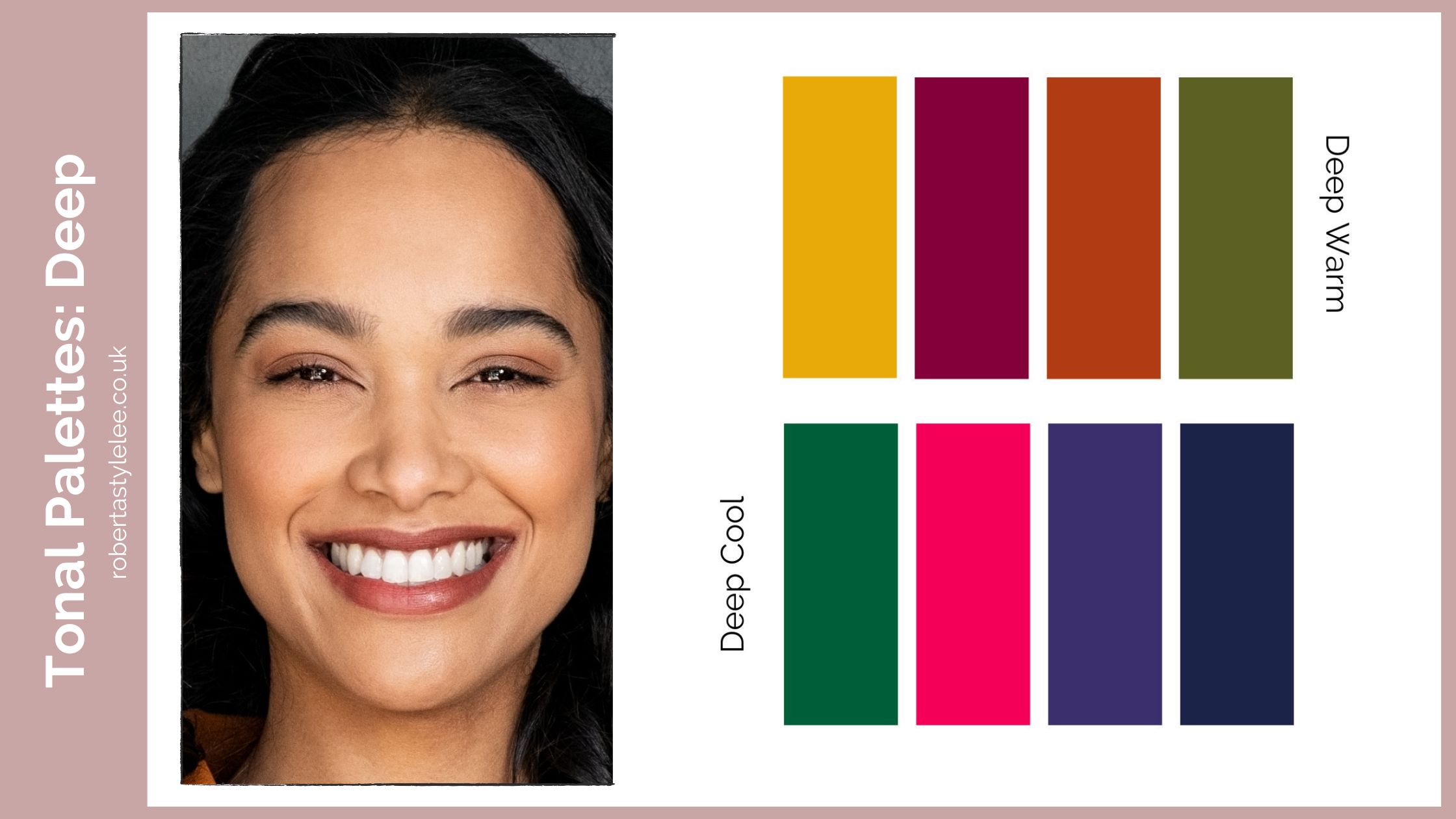
The Deep tonal sub-season is all about depth and richness. If you belong to this sub-season, your colouring has strong contrast, with deep and dark hair, and your eye colour may range from chestnut, dark brown to black. Deep sub-seasons within the 4 seasons flourish in intense and rich colours. Think deep jewel tones, dark earthy hues, and bold, saturated shades. These sultry colours can enhance your striking features and exude a sense of sophistication and intensity.
Colours that work well for Deep sub-seasons include deep jewel tones, such as emerald green, sapphire blue, and amethyst purple. Dark earthy hues, like chocolate brown, deep burgundy, and forest green, also complement your colouring. Bold and saturated shades, such as royal blue and rich red, make a statement and enhance your striking features.
Styling Tips: Embrace bold colour combinations and contrast to showcase your depth of colouring. Pair deep jewel tones together, like emerald green with sapphire blue, or create contrast with a bold shade against a dark neutral. Experiment with textures, such as velvet or leather, to add depth and visual interest to your outfits.
Tonal colour palette: Dark
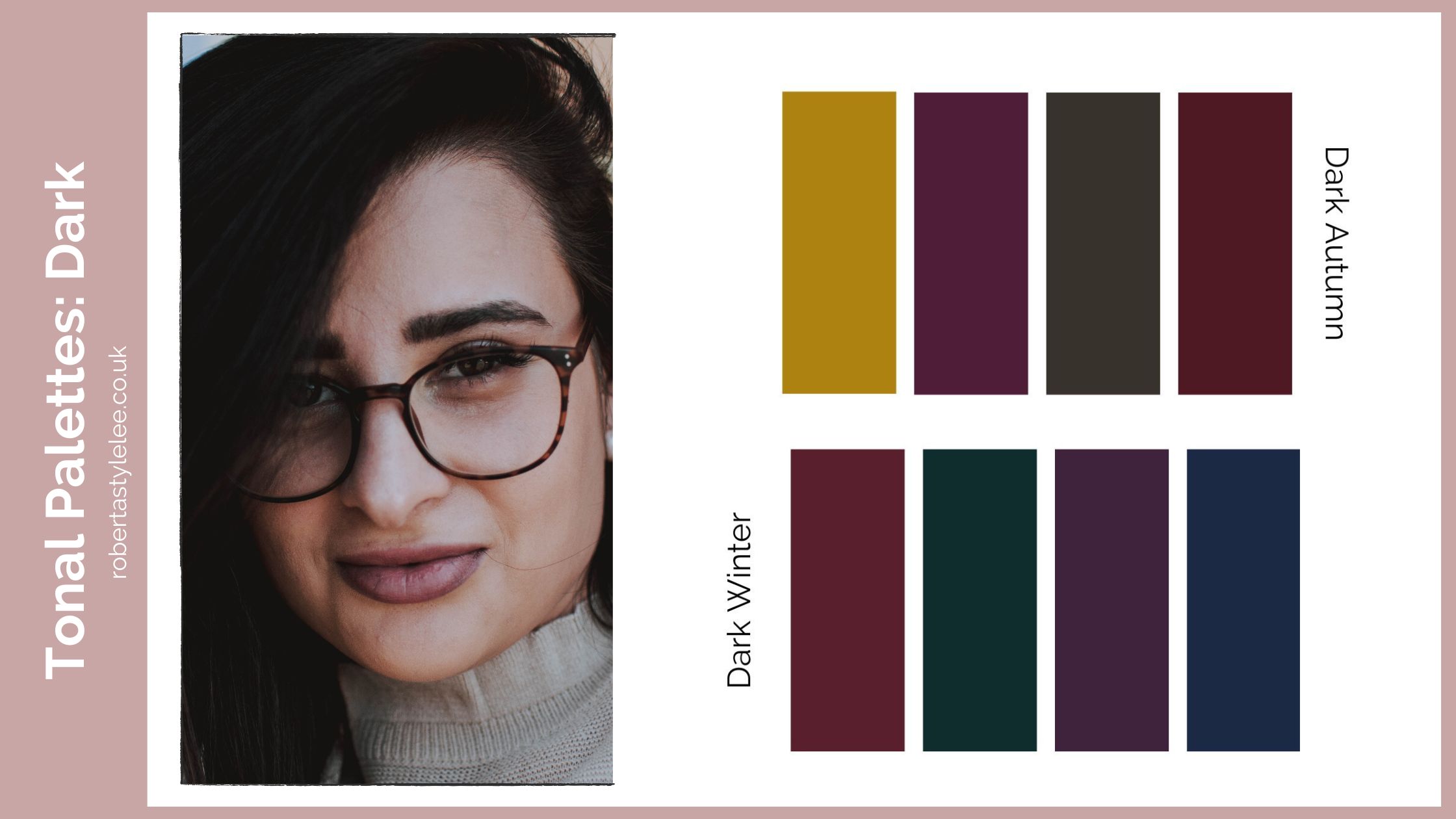
The Dark tonal sub-season is all about intense dark and muted colours. If you belong to this sub-season, your colouring has strong contrast, with deep and dark hair, your complexion will be more muted than someone with a Deep tonal sub-season (which is brighter), and your eye colour may range from chestnut, dark brown to black.
Dark sub-seasons within the 4 seasons have a sense of mystery and they can wear the most intense darkest of colours with ease. Think deep dark greens, rich earthy browns and the aubergine purples and inky navy blue, burgundy and earthy mustard yellows.
Styling Tips: Embrace contrasting colour combinations and contrast to showcase your depth of colouring. Pair mustard with deep navy, or mustard with aubergine create contrast with different shades against a dark neutral. Experiment with patterns, prints and textures to add depth and visual interest to your outfits.
Tonal colour palette: Cool
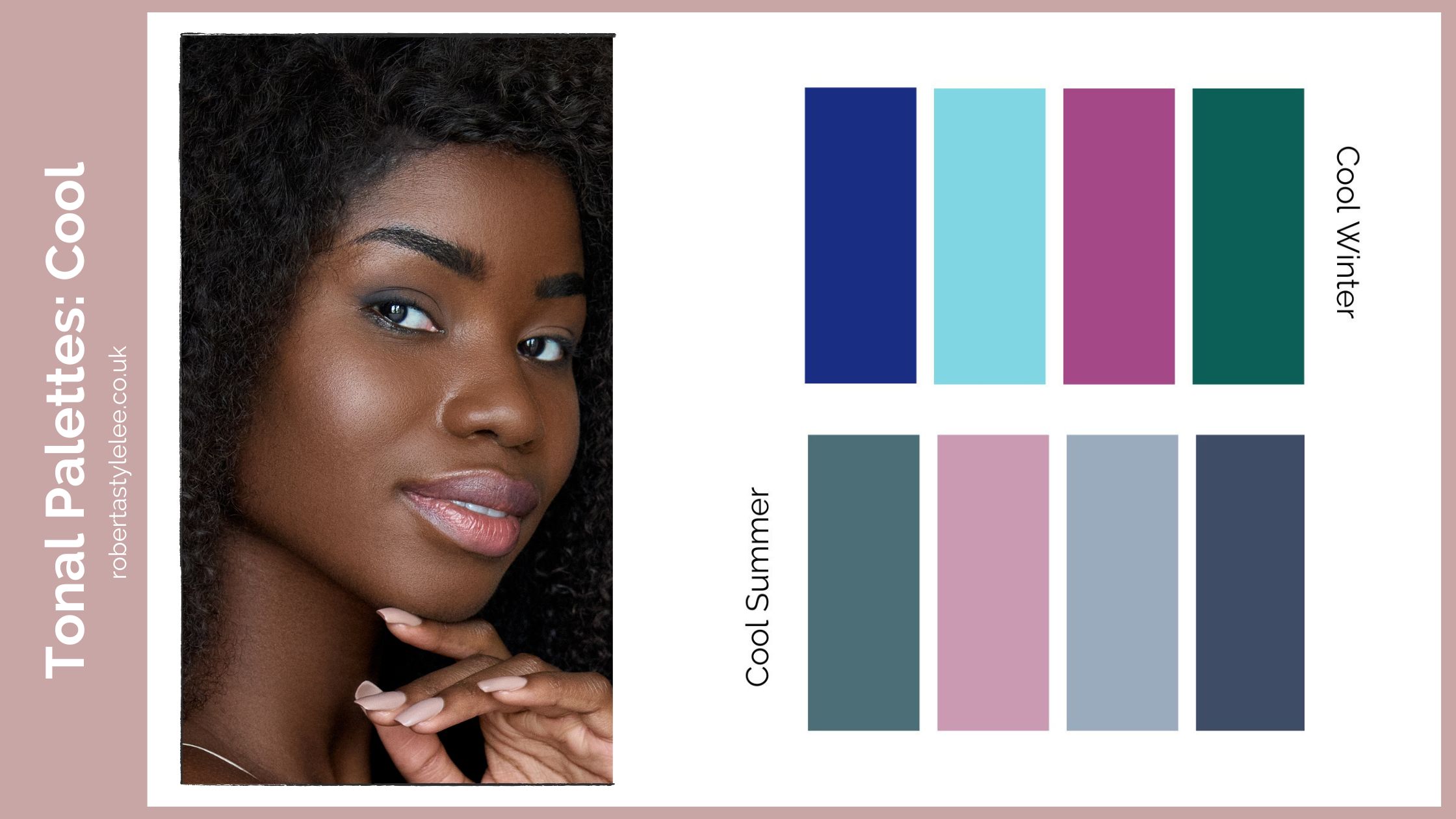
The Cool tonal sub-season is all about cool icy tones with a strong focus on and blue and pink, If you belong to this sub-season, your colouring has a noticeable coolness, you will have slightly less contrast than a Bright Winter, your hair colour can range from medium brown to black, hair and your eye colour may range from blue, brown, dark brown to black.
Cool sub-seasons within the 4 seasons have clarity and can pull off cooler colours without looking washed out. You have a large variety of pinks to choose from, bright pinks, cherry red, and berry tones as well as sky blue, navy blue, true blue, and a range of purples that will work in perfect harmony with your ashy coolness.
Styling Tips: Embrace contrasting colour combinations to showcase your ability to wear cooler colours Pair navy, berry and white, wear pinks and reds together. Cool Winters can also wear black and bright whites easily. Wear high-contrasting prints in cool colours to show off your cool creative personality.
Tonal colour palette: Warm
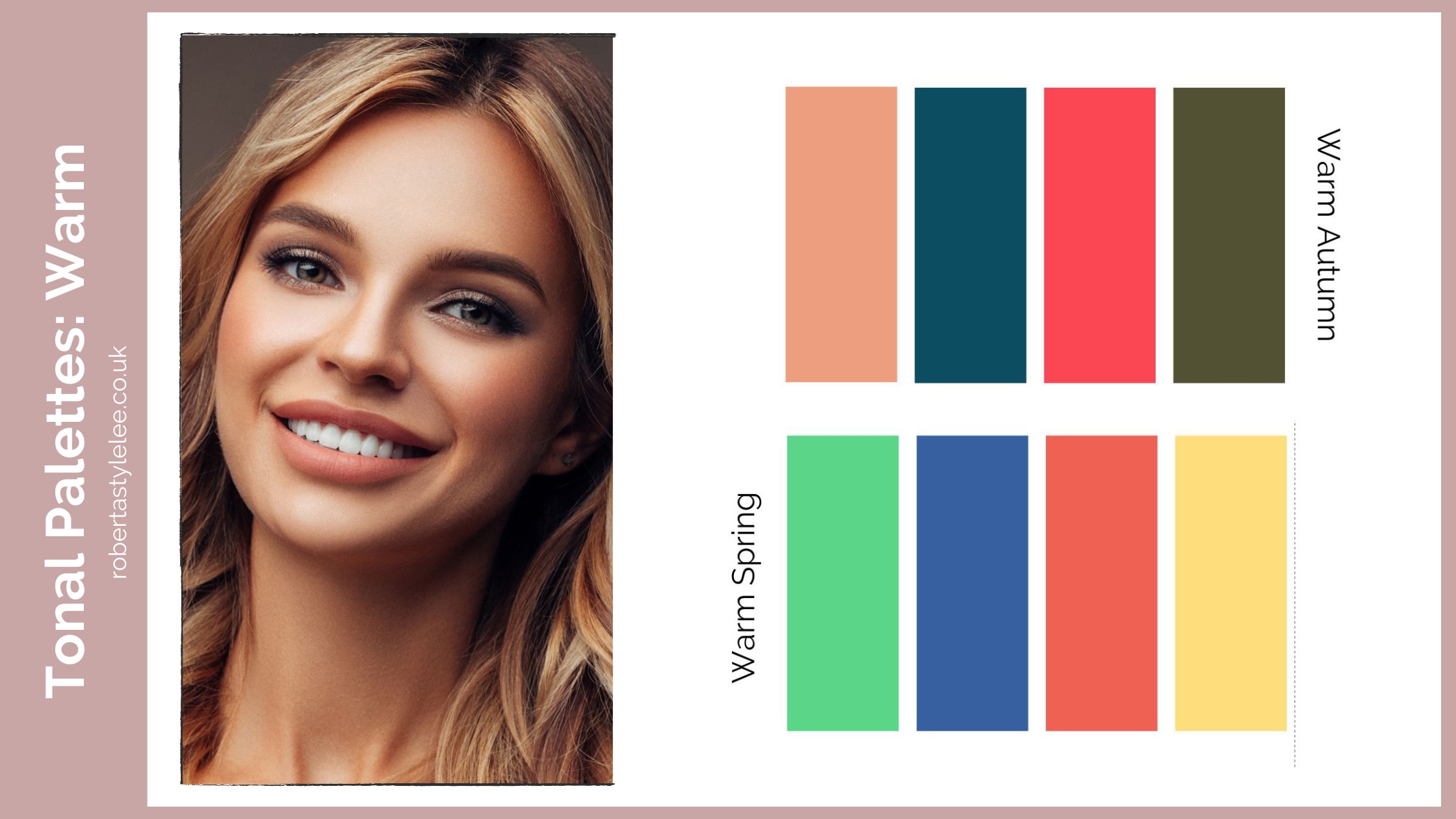
Your warmth will show as as a gentle sun-kissed glow and your hair colour can range from medium blonde, chestnut brown, and black to red, and your eye colour may range from blue, green, hazel, brown, dark brown to black.
Warm sub-seasons within the 4 seasons have clarity and can pull off warmer colours without looking jaundiced. You have colours with hints of orange, yellow and brown mixed in. The added warmth of colours such as peach, teal blue, orange-red, spring green, pumpkin orange and yellows work in perfect harmony with your warmth.
Styling Tips: For bright and warm types, embrace contrasting colour combinations to showcase your ability to wear fun colours or wear caramel browns with oyster white and a pop of colour. For more earthy types, embrace the colours of nature and wear browns, mustards and greens. Instead of black wear burgundy with cream.
Tonal colour palette: Bright Clear
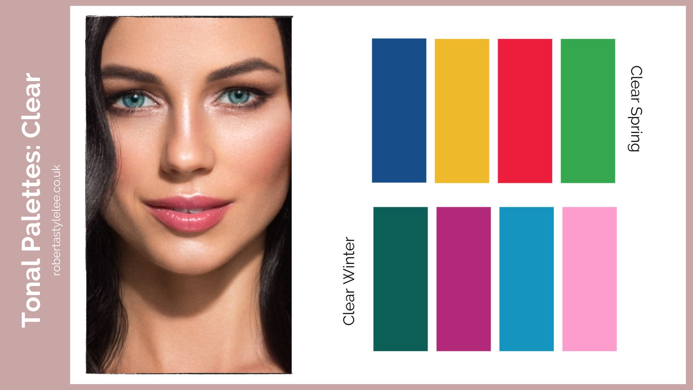
The Bright tonal sub-season is characterised by vivid and vibrant colouring. Your skin tone may have warm or cool undertones, and your hair and eye colours are typically bright and intense. Bright sub-seasons within the 4 seasons thrive in vibrant and bold colours. Think vibrant reds, electric blues, hot pinks, and saturated greens. This is often the most confused set of colours with Bright Winters and Bright Springs getting often seeing many cross-overs in the colours they can wear.
Colours that compliment Bright sub-seasons include vibrant reds, electric blues, hot pinks, and saturated greens. Yellow and orange shades, such as lemon yellow and fiery orange, also work well for you.
Styling Tips: Embrace colour blocking by pairing complementary bright shades together, such as a hot pink top with electric blue trousers. Incorporate bold patterns, like geometric prints or abstract designs, to add an extra dose of vibrancy to your outfits. Accessorise with statement jewellery or vibrant shoes to complete your bold and confident look.
Use Pinterest? Pin and save for later.
What about people with a neutral skin tone?
Neutrals can often wear a much broader range of colours, but taking into account the contrast of skin, hair, eyes and general appearance – a neutral isn’t limited to just one colour palette. This is why tonal analysis is often more beneficial for anyone struggling to define a set of colours in the 4-seasons.
Certain colour palettes within the tonal system tend to be more neutral as they sit between 2-seasons depending on personal preference and/or if you lean ever so slightly towards warmth in your hair or skin, or coolness, you might choose Spring/Autumn (slight warmth) or Cool Summer/Winter (slight coolness) versions of the colours.
More content coming soon on neutral undertones! I get asked this a lot so make sure you’re subscribed to the Roberta Style Lee mailing list so you don’t miss my latest releases. Pop any questions you have in the comments section below for me to review when I am creating the content.
Seasonal and tonal colour palettes summary:
Understanding the merits of both seasonal and tonal analysis can help you unlock your WOW colours and find true colour harmony.
Always consider your unique combination of features, we all have incredibly diverse variations to our appearance, seen in our skin, our undertones, our overtones, our hair colour, eye colour, and our overall contrast – all of these factors will influence the outcome.
One thing that won’t change is your undertone, that will always remain the same. However, the intensity of colours that are most complimentary as we get older, are often softer. I always recommend getting your colours done again if you’re starting to see changes in your skin texture and natural hair colour. If you’re London based and would like to discuss my upcoming availability for an in-person colour analysis experience, book a free consultation.
The most beneficial part of colour analysis for most people is knowing what colours to avoid – and the rest are fair game. Ultimately, the more focused our colour selection is in our wardrobes the easier it is to build outfits and get dressed with ease in the mornings.
Knowing your colours is one the most useful steps on your STYLE journey
Knowing your colours and figuring out what season you are in colour analysis, is a game changer for building a sustainable wardrobe. You’ll know exactly what colours to buy and avoid. This makes it easy to create a cohesive collection of easy-to-mix-and-match outfits (even if you’re a maximalist and not looking to create a smaller capsule wardrobe!). The more curated our wardrobes, the more likely we are to utilise what we’ve got and reach that elusive #100wears mark from our clothes.
READY FOR COLOUR CLARITY?
Stop guessing which colours work for you — with a private 1:1 online experience.

For me, the colour analysis process provided a great system for getting rid of pieces that weren’t suitable and streamlining a rather large collection of clothes. I found a great amount of reassurance in knowing what colours were an absolute no-no. Earlier on in my career I always thought that colour analysis would limit me as a stylist and hamper my creativity, but it actually made things easier! I wish they taught this to us all in school, as it provides such great insight into what works for our unique features and why, and I believe that would stop us from buying clothes we don’t wear and that end up in landfill.
If you’ve reached this point and still feel unsure where you sit, that’s completely normal.
Both seasonal and tonal systems give you language for colour, but they don’t always tell you how to apply it to yourself. This is exactly what I address in a one-hour Colour Clarity session, where we look at what actually works for you and why, so you can move forward without second-guessing.
Related Colour Analysis Articles
What are Cool Colours?
What are Warm Colours?
Cool Winter
Cool Summer
Warm Autumn
Warm Spring
Colour Analysis: How Colour Supports Your Presence and Identity
Colour Palettes vs Emotional Seasons: Rethinking Colour Analysis


10 thoughts on “Seasonal & Tonal Colour Palettes – A Comprehensive Guide”
Hi Roberta
I am new to this but went deep down the rabbit hole- fristratongky at times, for sure. Your information has been an absolute gift – so much insightful and clear explanation and example. I am a natural redhead but now add some red colour as it’s fading with age – I’m very freckled and pale with blue/grey eyes. I’m pretty sure at this point based on colours I’ve tried and responses I have gotten that I am a warm spring. I agree whole heartedly with your comment that this approach can actually save money and landfill space. I hope I have it now as the amount of clothing I am re-homing is significant- but feels great. Thank you so much for the help!!!!!
Does one’s “season” change with age? I am 67, with skin that is very fair, more cool than warm, that freckles but doesn’t tan much. I have dark brown eyes, and when younger had hair that was consistently medium brown to slightly darker. Now I have my natural gray, which is a mix of all shades, from dark, oddly reddish brown hairs to a range of grays. The lightest are at my face, and are light gray (not white). My eyebrows and eyelashes are graying also, so the contrast in my face and hair is disappearing! In what direction does that take my clothing color choices?
Hi Anne,
Yes, our colouring often softens with age – especially as hair lightens and contrast reduces. From your description, it sounds like you’ve retained a cool undertone, but now have lower contrast, which means strong Winter shades might feel too harsh.
I’d explore True Summer, Soft and Light Summer, you mention some warmth in your hair – so maybe even look at Soft Autumn – these might feel gentler on the skin. Try soft navy, rose pink, burgundy or plum and grey near your face to see if that feels better without being too overpowering.
I was analyzed as a cool clear light in tonal analysis. Do you have any idea what that could translate to in seasonal color analysis? It would be nice to know so I can understand it better
That sounds like Light Summer!
This post is so informative. I like it an found very helpful. Thanks for sharing.
That’s amazing to hear. Thank you so much for taking the time to share your thoughts.
This is so interesting!
I have always been drawn to the colours in the Bright Winter pallette, however, I don’t really fit into that box with my skin undertones. I have dark brown hair, blue eyes and pale skin but with a more yellow/olive undertone – although a recent trip to a makeup counter left me confused as the artist matched me to a neutral undertone (rosacea and scarring may confuse things?)
The examples with the models really helped though as my colourings are closest to the model with the bright pallette so I’m hoping I could pull off switching between Winter and Spring.
I found this very informative & easily explained by Roberta. It’s also good that you can refer back to this blog at anytime you wish for guidance.
Thank you Roberta x
You are so welcome! Colour analysis can be a bit overwhelming and I find visual examples simplified like this can help us ‘see’ the differences in colours a little easier.