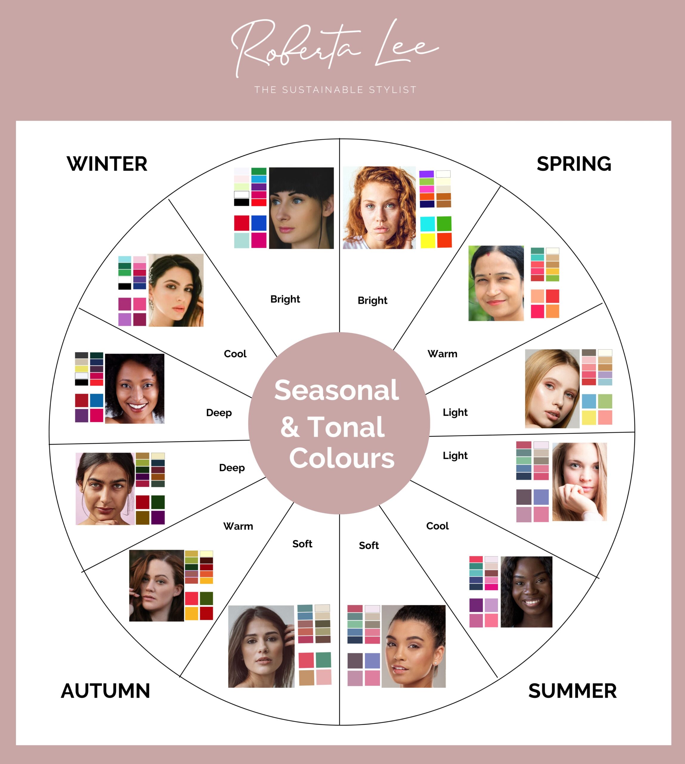
Having difficulty understanding the 12 seasons in colour analysis? Do you know what to look for in colours? There’s light, dark, deep, cool, warm, soft, clear, light and muted, dark and muted, light and clear, dark and clear as well as neutral!
Take a look at this handy guide to help you identify the differences in chroma and value, and notice the subtle differences across the 4-seasons (further defined into 3-sub seasons for each). I have created example colour swatches for both warm and cool, as well as some examples for neutral colour palettes. In the example below you can see the colours and and a model that has features that harmonise best with those colours.
Note: Please note that while these examples feature stock images with diverse skin tones, the photos selected do not represent the exclusive range of skin tones that can wear these colours. Book in for a 1:1 colour analysis in London to get the most accurate results.
Most people don’t struggle because they can’t see colour. They struggle because they don’t know how to interpret what they’re seeing on themselves. And this is where the 12-season system becomes confusing. It gives you more detail, but not necessarily more clarity.
The colour chart below should also help you see the subtle differences between warm and cool colours and why the temperature (hue) isn’t the only thing to pay attention to.
We need to understand the differences in the colour chroma: how muted or bright a colour is.
We also need to recognise the colour’s value: the intensity, how light or dark the colour is, often referred to as saturation (intensity of the colour).
Understanding these terms is one thing. Applying them to yourself is something else entirely.
This is where most people get stuck. They can recognise colour differences on a chart, but when it comes to their own wardrobe, the decisions still feel unclear.
What makes this harder is that these categories don’t exist in isolation. You’re not just “light” or “soft” or “warm”. You’re a combination elements, and that is where it can become very confusing.
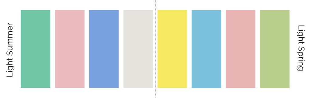
Light Colour Analysis Example Colours
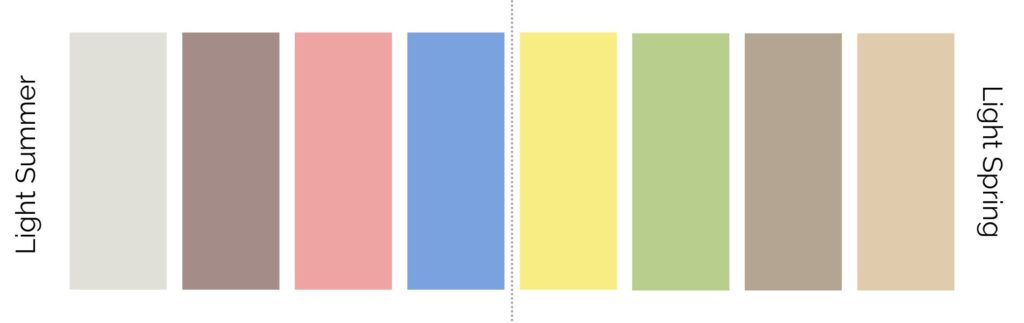
When we look at light colours that have a soft and delicate appearance. They are typically lighter in value and can include pastels, soft neutrals, and light shades of various colours, Imagine lots of white being added to make the colour less saturated.
Dark Colour Analysis Example Colours
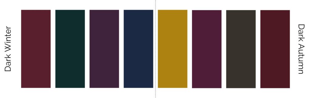
When we look at dark (or deep) colours they have a much deeper and richer appearance. They are often deeper in value and include darker shades of colours like deep burgundy, navy blue, or forest green, imagine black being added to make the colours darker for an evening scene in a painting.
Deep Colour Analysis Example Colours
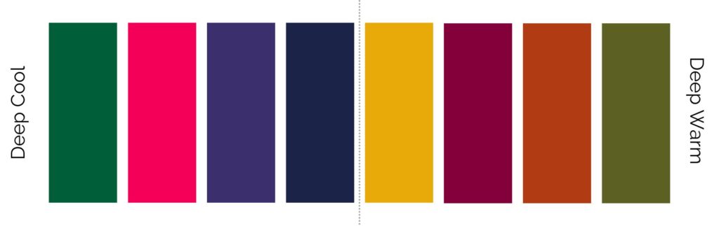
When we look at deep colours they are rich and intense. These shades have a high saturation level and are often bold and vibrant, like deep jewel tones.
Cool Colour Analysis Example Colours
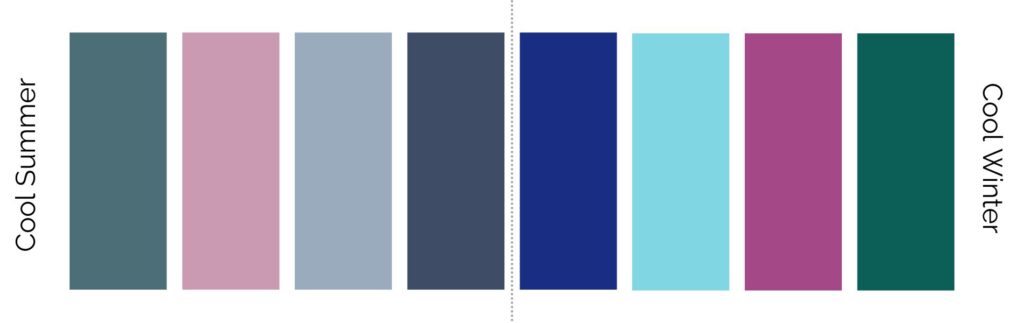
When we look at cool colours they have a distinct cool undertone. They tend to have hints of blue in them, and it gives them a fresh and crisp appearance. Examples include cool shades of blues, purples, and greens.
Warm Colour Analysis Example Colours
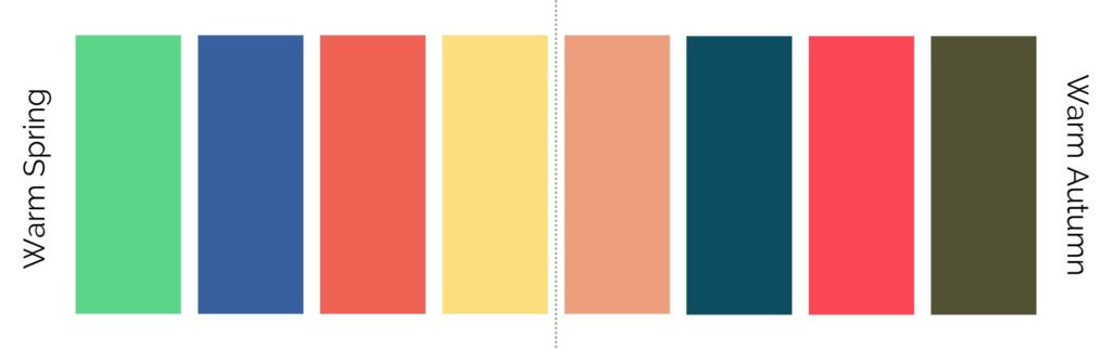
When we look at warm colours they have a noticeable warmth to them. They often have hints of yellow or red in them, creating a cosy and inviting look. Examples include warm shades of reds, oranges, and yellows, very typical of the natural colours we see during Autumn.
Soft Colour Analysis Example Colours
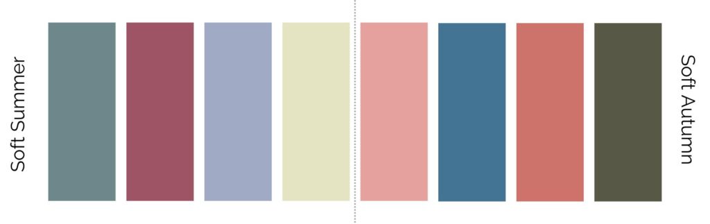
When we look at soft colours they have a muted and gentle quality. They are typically less vibrant and have a more subdued appearance. Soft colours can include dusty pinks, muted greys, or muted earth tones. These are colours that look like they’ve had a selfie filter applied!
Clear Colour Analysis Example Colours
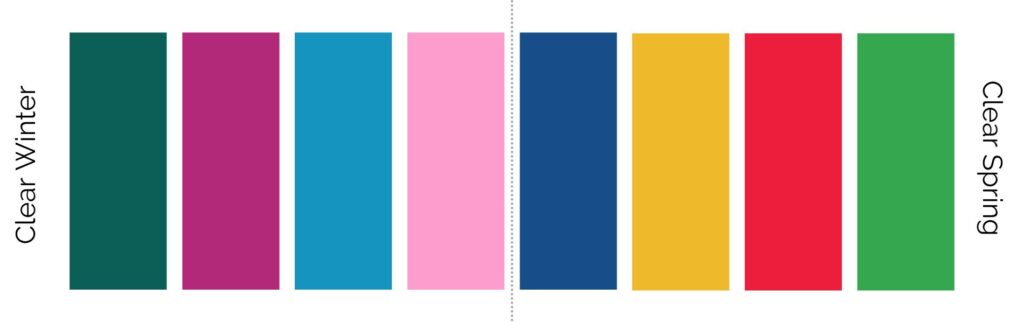
When we look at clear colours – they have high contrast and clarity. They are often vibrant and sharp, creating a bold and striking effect, and include bright primary colours like true red, royal blue, or sunny yellow.
Light & Muted Colour Analysis Example Colours
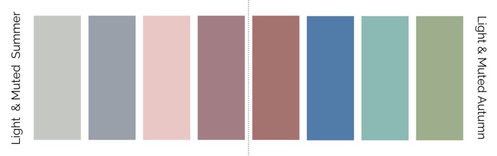
Light-muted colour variations combine the lightness of light colours with a muted quality. They have a gentle and understated appearance, such as pale soft pastels with a touch of grey or muted neutrals with a light tint.
Dark & Muted Analysis Example Colours
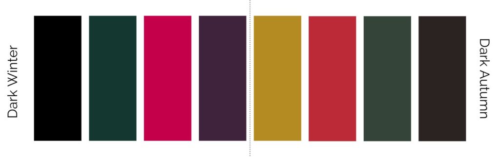
When we look at dark-muted colour variations they combine the richness of dark colours with a muted quality. They have depth and intensity but with a softer and more understated effect. Examples include deep muted jewel tones or darkened neutrals with a muted undertone.
Light & Clear Colour Analysis Example Colours
When we look at light-clear colour variations they have the softness of light colours with the clarity of clear colours. They have a luminous and crisp appearance, such as light and bright pastels or light shades of clear primary colours. Imagine all these colours having white paint added to them to lighten them up.
Dark & Clear Colour Analysis Example Colours
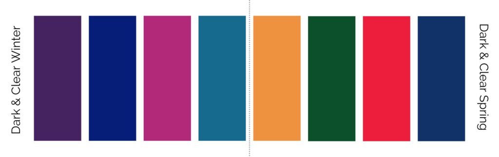
When we look at dark-clear colours they combine the richness of dark colours with the clarity of clear colours. They have depth and vibrancy, creating a strong and striking impact. Examples include rich and clear jewel tones or dark shades of clear primary colours.
Neutral Colour Analysis Example Colours
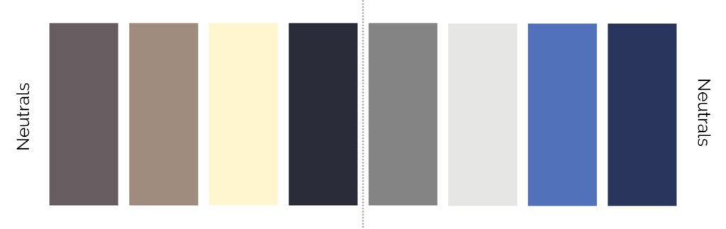
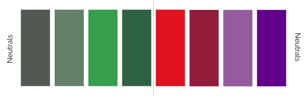
When we look at colour options for those with neutral undertones, the colour variations consist of colours that have a balanced and versatile quality. They are neither strongly warm nor cool, too bright or too muted, and they can work well as foundation or accent colours across different seasons.
Neutral base colours can include various shades of grey, blue, beige, or taupe and cream. There are certain colours such as fire engine red, purples, burgundy and greens that tend to work well on those with neutral undertones too. This selection of colours is just a small sample of what someone with neutral undertones can explore.
If you’re reading this and trying to work out where you sit, you’re not alone. Most people move between categories, second-guess what they’re seeing, or feel like they fit into more than one description. At that point, more information doesn’t usually help – it tends to create more noise.
12 seasons in colour analysis
It’s important to remember that everyone has unique DNA, and whilst these colours might work for the majority, as an individual you still need to pick the best ones for yourself. These are just examples. Not all colour options provided in the colour palette will work for everyone but this more advanced system of defining colours can help you find colours that are in harmony with your undertones – and what to look for in the colours that suit you.
12 seasons summary
Hopefully seeing the colour variation terms used within the 12 seasons, rather than me just speaking about them allows you to see there is a more nuanced understanding of colours that is required to be able to identify these colours.
When we refer to colours and say, you look best in either light, dark, deep, cool, warm, soft, clear, light and muted, dark and muted, light and clear, dark and clear, or neutral, this is what we mean. Understanding the subtle differences in colours can help you better identify complimentary (and less complimentary) colours for yourself when you are curating new pieces for your wardrobe.
If you’ve reached this point and still feel unsure where you sit, that’s completely normal. This is exactly what I address in a one-hour Colour Clarity session, where we look at what actually works for you and why, so you can move forward without second-guessing.
When colour becomes the beginning, not the answer
What I’ve noticed is that colour analysis rarely stays just about colour. For many women it becomes the starting point for a wider shift — a wardrobe that finally feels coherent, a clearer sense of what’s worth keeping, or the recognition that something deeper has changed.
If you’re ready to identify your colours, the Online Colour Clarity Session is the place to start. If you’re London-based and want to go deeper in person, the VIP Colour Analysis Experience is the next step. And if reading this has made you realise your style and wardrobe questions go deeper than colour alone, the Style Synopsis is where to start for a wardrobe that starts with a clear strategy.
Before being trained in colour analysis, I will be honest I wasn’t sure what I was looking for in colours – all I knew was if I liked a colour or not. Sometimes I would wear colours I loved, but looking back, those colours didn’t love me. Understanding colours is a really useful tool if you want to use colours to enhance how you feel and know what tones harmonise with your natural complexion.
Related Colour Analysis Articles
What are Cool Colours?
What are Warm Colours?
Cool Winter
Cool Summer
Warm Autumn
Warm Spring
Colour Analysis: How Colour Supports Your Presence and Identity
Colour Palettes vs Emotional Seasons: Rethinking Colour Analysis


2 thoughts on “12 Seasons in Colour Analysis, Examples of Colour”
Hi! Thanks for this- very informative. I am interested in your workshops so let me know!
Thank for for this, and showing the range of colors how they transistion.